pen <- palmerpenguins::penguins
library(gtsummary)
library(tidyverse)
library(performance) # for check_model.

# Additional packages that you will have to install but don't need to load
# see (for check_model)
# webshot2 (for gtsave)How do I….
This page is dedicated to showing example code for selected tasks.
Create Nice variable names
Select the variables of interest and rename them nicely using select. Note any name with a space in it has to be surrounded by a back tick (to the left of the 1 key)
analysis.data <-
  pen %>%
  select(`Bill Depth (mm)` = bill_depth_mm,
         `Bill Length (mm)` = bill_length_mm,
         Sex = sex, Species = species) %>%
  na.omit()
Fixing Table Summary
Summarize a continuous variable across a categorical variable with many levels?
:::{.callout-important title = “Problem”}
Sometimes the categorical variable has so many levels, or the level names are so long that the table wraps off the edge of the PDF and is unreadable.
:::
pen |>
  tbl_summary(
  include = bill_length_mm,
  by = species
)| Characteristic | Adelie N = 1521 |
Chinstrap N = 681 |
Gentoo N = 1241 |
|---|---|---|---|
| bill_length_mm | 38.8 (36.7, 40.8) | 49.6 (46.3, 51.2) | 47.3 (45.3, 49.6) |
| Unknown | 1 | 0 | 1 |
| 1 Median (Q1, Q3) | |||
:::{.callout-tip title = “Solution”}
There is no easy way to rotate or “transpose” a gtsummary object. One approach is to manually use a “split-apply-combine” method.
- we “map” a function
\()across all levels ofpen$speciesindexing bys - For
speciess, we create atbl_summary - where we modify the header to have a common name of the numeric variable in question
- And change the label of the row to the species level
s - Then we
stackthe tables together, and replace theheaderwith the name of the Categorical variable :::
purrr::map(levels(pen$species), \(s)
  pen |>
    filter(species == s) |>
    tbl_summary(include = bill_length_mm, missing = "no") |>
    modify_header(all_stat_cols() ~ "**Bill length (mm)**") |>
    modify_table_body(~ mutate(.x, label = s))
  ) |>
  tbl_stack(group_header = NULL) |>
modify_header(label ~ "**Species**")| Species | Bill length (mm)1 |
|---|---|
| Adelie | 38.80 (36.70, 40.80) |
| Chinstrap | 49.6 (46.3, 51.2) |
| Gentoo | 47.30 (45.30, 49.60) |
| 1 Median (Q1, Q3) | |
Another approach is to use dplyr to group_by and summarize, then pass the data frame into kable from the knitr package to make a nicer table.
- Create your summary statistics using
group_byandsummarize. - Create a new variable as the column header, using back ticks to allow for a “non standard” variable name.
- Create this new variable by
paste’ing the value of the mean and sd together with parenthesis, after rounding to 2 digits. selectthe variables you want to display- Pass it to
kable()
pen |>
  group_by(species) |>
  summarize(mean=mean(bill_length_mm, na.rm=TRUE),
            sd = sd(bill_length_mm, na.rm=TRUE)) |>
  mutate(`Bill Length(mm)` = paste0(round(mean,2), " (", round(sd,2), ")")) |>
  select(Species= species, `Bill Length(mm)`) |>
knitr::kable()| Species | Bill Length(mm) |
|---|---|
| Adelie | 38.79 (2.66) |
| Chinstrap | 48.83 (3.34) |
| Gentoo | 47.5 (3.08) |
See the kableExtra vignette for additional references on how to prettify this table.
Force data type in your summary table
:::{.callout-important title = “Problem”} tbl_summary sometimes thinks integer data with few distinct values is a categorical variable and so will return N(%) instead of mean (SD). :::
pen_example |>
  tbl_summary(
  include = c(body_mass_g, sex)
)| Characteristic | N = 201 |
|---|---|
| body_mass_g | |
| 3175 | 2 (10%) |
| 3475 | 3 (15%) |
| 3600 | 7 (35%) |
| 3750 | 5 (25%) |
| 5350 | 3 (15%) |
| sex | |
| female | 9 (47%) |
| male | 10 (53%) |
| Unknown | 1 |
| 1 n (%) | |
:::{.callout-tip title = “Solution”} Specify the correct data type in the tbl_summary function directly. :::
pen_example |>
  tbl_summary(
  include = c(body_mass_g, sex),
  type = list(body_mass_g ~ "continuous"),
  statistic = list(body_mass_g ~ "{mean} ({sd})")
)| Characteristic | N = 201 |
|---|---|
| body_mass_g | 3,839 (672) |
| sex | |
| female | 9 (47%) |
| male | 10 (53%) |
| Unknown | 1 |
| 1 Mean (SD); n (%) | |
Regression Tables
Multiple regression models in the same table
Fit each model separately, and save the result of the tbl_regression as an object.
model.1 <- lm(`Bill Depth (mm)` ~ `Bill Length (mm)` + Sex, data=analysis.data) |>
  tbl_regression() |>
  add_glance_table(include = c(adj.r.squared, nobs))

model.2 <- lm(`Bill Depth (mm)` ~ `Bill Length (mm)` + Sex + Species, data=analysis.data) |>
  tbl_regression() |>
  add_glance_table(include = c(adj.r.squared, nobs))

tbl_merge(
  list(model.1, model.2),
  tab_spanner = c("**Model 1**", "**Model 2**")
) |>
  modify_table_body(
    ~arrange(.x, row_type == "glance_statistic")
)| Characteristic |
Model 1
|
Model 2
|
||||
|---|---|---|---|---|---|---|
| Beta | 95% CI | p-value | Beta | 95% CI | p-value | |
| Bill Length (mm) | -0.15 | -0.18, -0.11 | <0.001 | 0.07 | 0.03, 0.11 | <0.001 |
| Sex | ||||||
| female | — | — | — | — | ||
| male | 2.0 | 1.6, 2.4 | <0.001 | 1.3 | 1.0, 1.5 | <0.001 |
| Species | ||||||
| Adelie | — | — | ||||
| Chinstrap | -0.61 | -1.1, -0.16 | 0.008 | |||
| Gentoo | -4.0 | -4.4, -3.6 | <0.001 | |||
| Adjusted R² | 0.279 | 0.827 | ||||
| No. Obs. | 333 | 333 | ||||
| Abbreviation: CI = Confidence Interval | ||||||
Exporting regression model results
Make it look good first.
model <- lm(`Bill Depth (mm)` ~ `Bill Length (mm)` + Sex, data=analysis.data)

# Set a theme
theme_gtsummary_compact()
model %>%
  tbl_regression() %>%
add_glance_table(include = c(adj.r.squared, nobs))| Characteristic | Beta | 95% CI | p-value |
|---|---|---|---|
| Bill Length (mm) | -0.15 | -0.18, -0.11 | <0.001 |
| Sex | |||
| female | — | — | |
| male | 2.0 | 1.6, 2.4 | <0.001 |
| Adjusted R² | 0.279 | ||
| No. Obs. | 333 | ||
| Abbreviation: CI = Confidence Interval | |||
See the vignette for more theme options.
Then add the code to export it as an image.
model %>%
  tbl_regression() %>%
  add_glance_table(include = c(adj.r.squared, nobs)) %>%
  as_gt() %>%
  gt::gtsave(filename = "model_results.png", expand = 10)
Instructions for JupyterHub
The above code uses the webshot2 package to convert the model results to a png through an intermediary html file using Chrome. This won’t work when using JupyterHub/RStudio in the cloud.
Here is a solution that will write it directly to a powerpoint file, at a size that should look fine when imported into your poster slide. This requires the packages flextable and officer - these may already be installed.
library(gtsummary)
library(flextable)
library(officer)

# fit model
tbl <- lm(bill_length_mm ~ body_mass_g, data = pen) |>
  tbl_regression() |>
  add_glance_table(include = c(adj.r.squared, nobs)) |>
  # convert to flex table
  as_flex_table() |>
  # set font size
  fontsize(size = 24, part = "all") |>
  autofit()

# create a blank powerpoint file
prs <- read_pptx() |>
  add_slide(layout = "Blank", master = "Office Theme") |>
  # add the table as a slide
  ph_with(tbl, location = ph_location(left = 0.5, top = 0.5, width = 9, height = 4))

# write this powerpoint file to your working directory
print(prs, target = "model_results.pptx")
Log linear model + gtsummary
If you fit a log-linear model using lm(log(y)~x), tbl_regression doesn’t want to auto-exponentiate your coefficients and CI for you. Here is the workaround
# not run
tbl <-
  lm(log(mpg) ~ am, mtcars) |>
  tbl_regression()

# run this function to see the underlying column names in `tbl$table_body`
# show_header_names(tbl)

tbl |>
  # remove character version of 95% CI
  modify_column_hide(ci) |>
  # exponentiate the regression estimates
  modify_table_body(
    \(x) x |> mutate(across(c(estimate, conf.low, conf.high), exp))
  ) |>
  # merge numeric LB and UB together to display in table
  modify_column_merge(pattern = "{conf.low}, {conf.high}", rows = !is.na(estimate)) |>
  modify_header(conf.low = "**95% CI**") |>
  as_kable()
ref: Stack Overflow
Plots
Export to a file
Make it look good first.
ggplot(analysis.data, aes(x=`Bill Length (mm)`,
                          y = `Bill Depth (mm)`,
                          color = Sex)) +
  geom_point() +
  theme_bw(base_size=18)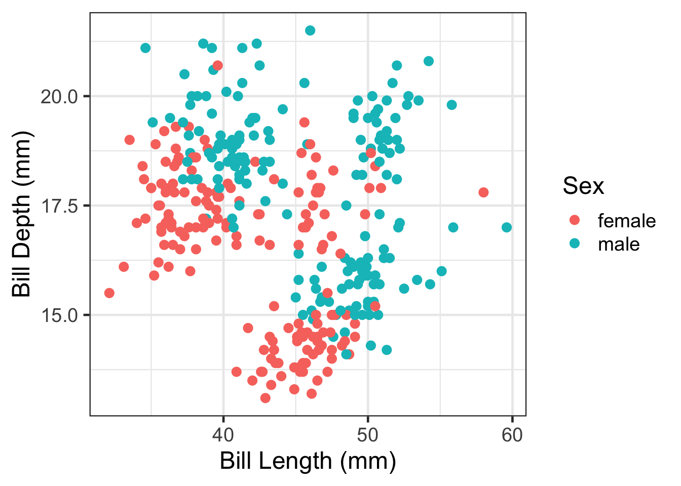
Then save. Import this into your poster file and adjust the width and height as needed.
ggplot(analysis.data, aes(x=`Bill Length (mm)`,
                          y = `Bill Depth (mm)`,
                          color = Sex)) +
  geom_point() +
  theme_bw(base_size=18)
  ggsave(filename = "myplot.png",  plot = get_last_plot(),
         width = 6, height = 6, units = "in")
Remove a legend
ggplot(pen, aes(x=island, fill = island)) + geom_bar() +
  theme(legend.position="none")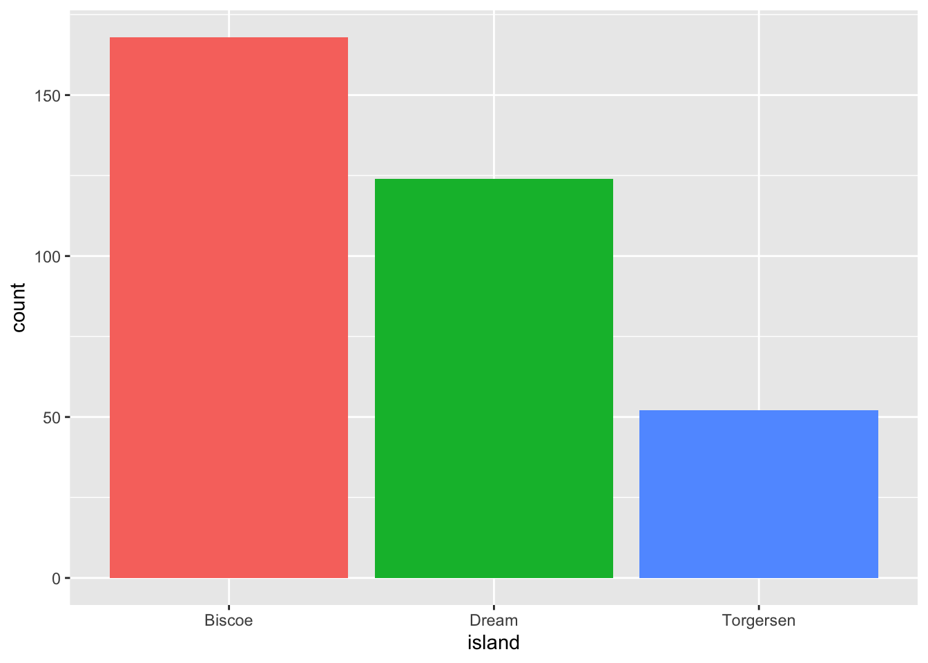
Resizing your output
Necessary to not make certain plots super squished in your rendered PDF file.
Without resizing.
check_model(model) # from the performance package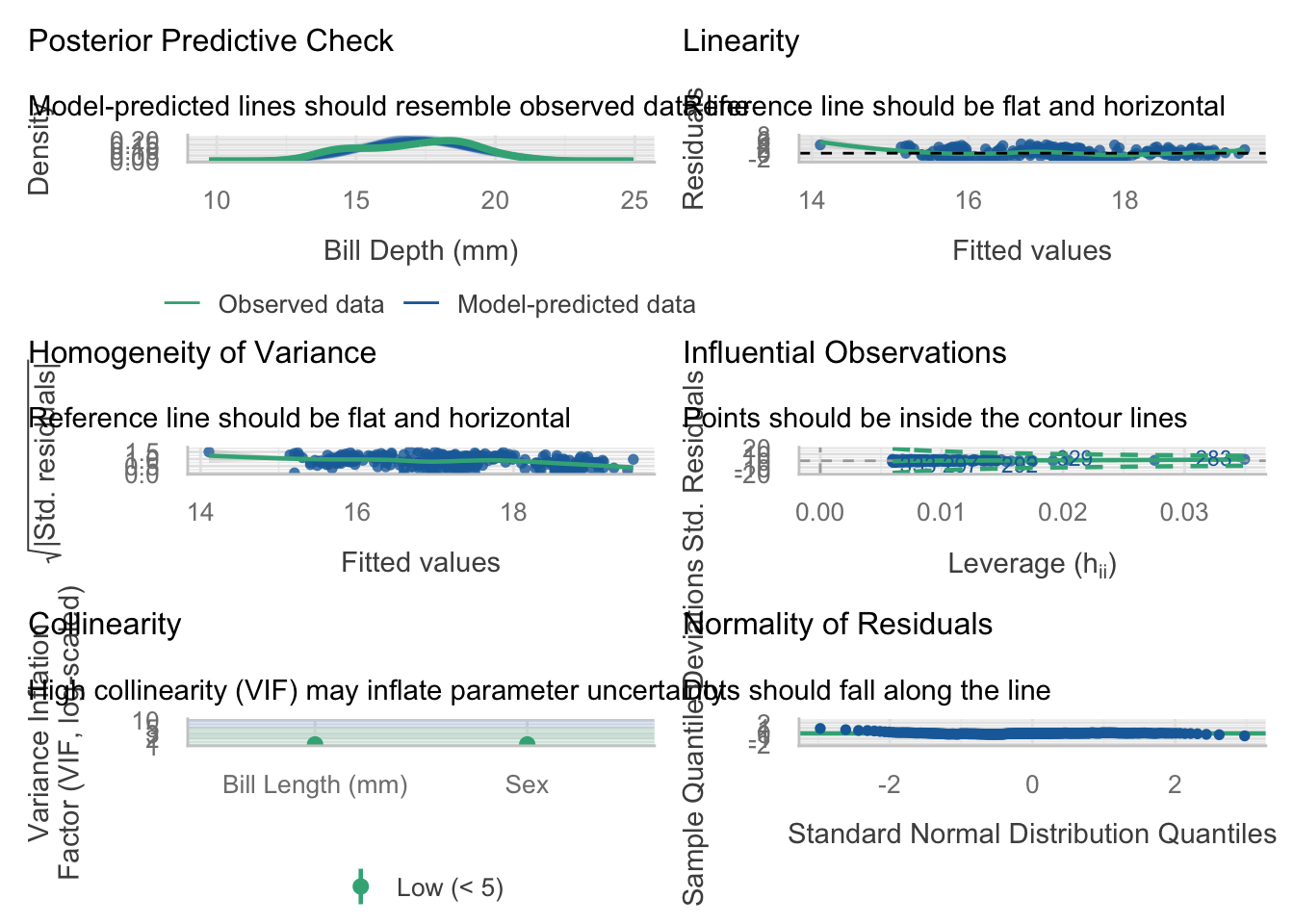
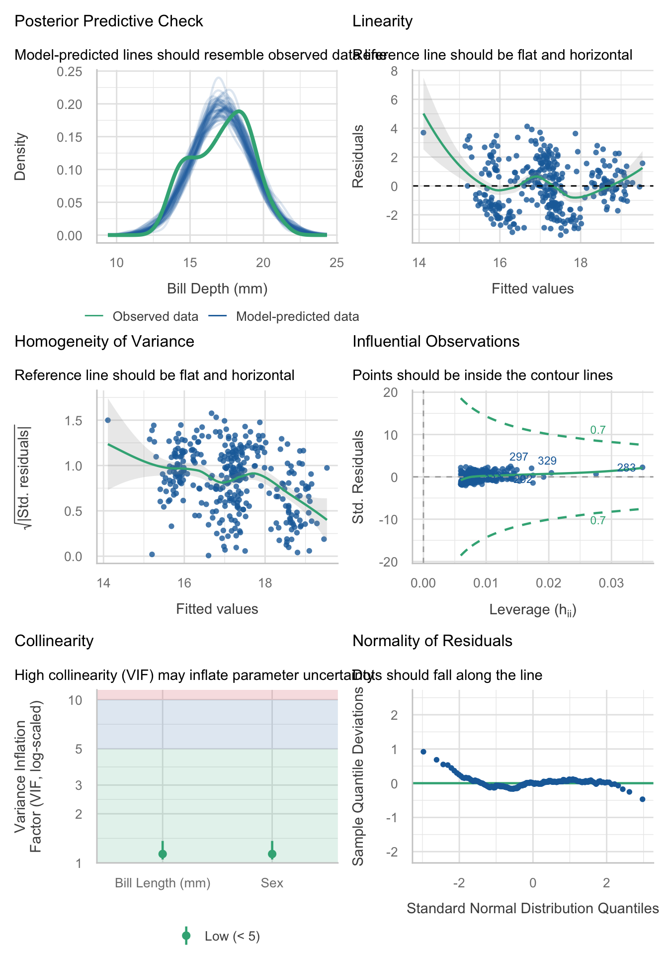
Apply a code chunk option (#|) to resize the height
```{r}
#| fig-height: 10
check_model(model)
```
Visualizing regression models with forest plots
library(broom)

m1 <- lm(`Bill Depth (mm)` ~ `Bill Length (mm)` + Sex, data = analysis.data)
m2 <- lm(`Bill Depth (mm)` ~ `Bill Length (mm)` + Sex + Species, data = analysis.data)

bind_rows(
  tidy(m1, conf.int = TRUE) |> mutate(model = "Model 1"),
  tidy(m2, conf.int = TRUE) |> mutate(model = "Model 2")
) |>
  filter(term != "(Intercept)") |>
  mutate(term = recode(term,
    "`Bill Length (mm)`" = "Bill Length (mm)",
    "Sexmale"            = "Sex: Male",
    "SpeciesChinstrap"   = "Species: Chinstrap",
    "SpeciesGentoo"      = "Species: Gentoo"
  )) |>
  mutate(term = factor(term, levels = rev(c(
    "Bill Length (mm)",
    "Sex: Male",
    "Species: Chinstrap", "Species: Gentoo"
  )))) |>
  ggplot(aes(x = estimate, y = term,
             xmin = conf.low, xmax = conf.high,
             color = model)) +
  geom_pointrange(position = position_dodge(width = 0.5)) +
  geom_vline(xintercept = 0, linetype = "dashed") +
  labs(x = "Estimate (95% CI)", y = NULL, color = NULL) +
  theme(legend.position = "top")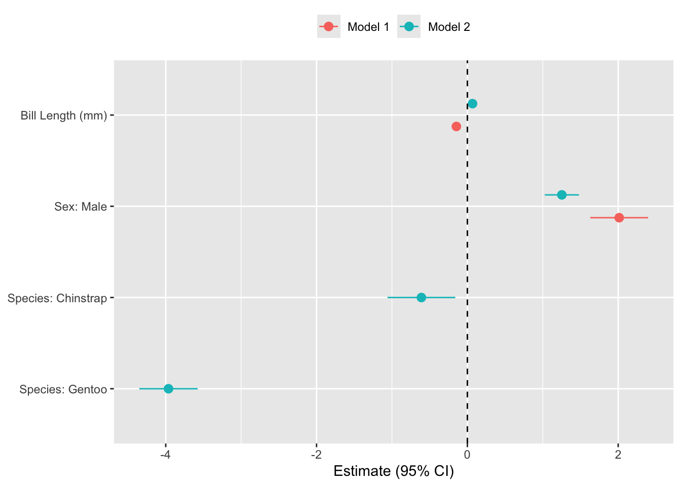
Code Explainer
- Start by saving the results of your models as objects (e.g.
m1andm2). - Extract coefficients CI’s from each model using
broom::tidy(), and specify a unique model name. - Remove the intercept
- Convert variable names (e.g.,
Sexmale) into human-readable labels - Set variable order as an ordered factor in
reverse so the y-axis matches the regression table top-to-bottom. - Plot the estimates on x, variable on y, CI bounds to
xmin/xmax, and color on model. - Plot each estimate as a point with whiskers spanning the CI.
position_dodge()offsets Model 1 and Model 2 vertically so they don’t overlap. - Draw a vertical reference line at zero to make it easy to judge statistical significance.