# Load libraries
library(tidyverse)
library(sjPlot)
library(ggpubr)
library(gtsummary)

load(here::here("data/depression_clean.Rdata")) # replace depression_clean.Rdata with YOUR data set name that you exported at the end of hw3HW 04: Describing Distributions
Let the data be beautiful
Purpose
There are a variety of conventional ways to visualize data - tables, histograms, bar graphs, etc. The purpose is always to examine the distribution of variables related to your research question. You will create a plot, follow up each graphic with a table of summary statistics (for quantitative variables) or frequency and proportion table (for categorical), and then a summary paragraph that brings it all together.
Instructions
Right click and download this template, then put it into your Homework folder.
PART 1: Completely describe 2 categorical and 2 quantitative variables using all of the following:
- An explanation of what the variable is, and how it is measured.
- Identify which ones are related to your research question (e.g. primary explanatory and primary response)
- A table of summary statistics
- using
table()for categorical andsummary()for quantitative
- using
- An appropriate plot with titles and axes labels
- use
plot_frqfor categorical and both a histogram and boxplot for quantitative
- use
- A short paragraph description in full complete English sentences with supporting numbers.
- Categorical must include N and % for _at least_the largest category
- For quantitative you must describe the center, shape and spread. Note any outliers.
- Take note of categories that should not be there, outliers or potential data mistakes (e.g. having 99 children when 99 was a missing data code you forgot to deal with)
PART 2: Create an all-inclusive summary table using the tbl_summary() function inside the gtsummary package. Use the code at the bottom of this page and replace the variables used. Include all 4 variables that were analyzed as part of this assignment.
Submission instructions
- Upload your PDF to Canvas by the due date.
Example - Part I
Depressed
The depressed variable is an indicator variable created from the CESD scale to identify potential clinical depression. This variable has two levels: depressed or not depressed.
table(clean$depressed)
    depressed not depressed
45 249 plot_frq(clean$depressed)
The majority of respondents in this data set are not considered depressed; 84.7% (n=249) individuals did not meet the threshold on the CESD scale to indicate potential clinical depression.
Age
summary(clean$age) Min. 1st Qu. Median Mean 3rd Qu. Max.
18.00 28.00 42.50 44.41 59.00 89.00 ggviolin(clean$age, add = c("jitter", "boxplot")) +
coord_flip() + labs(x="", y="Age")
gghistogram(clean$age, add_density = TRUE) + xlab("Age")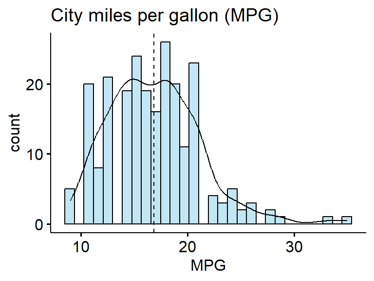
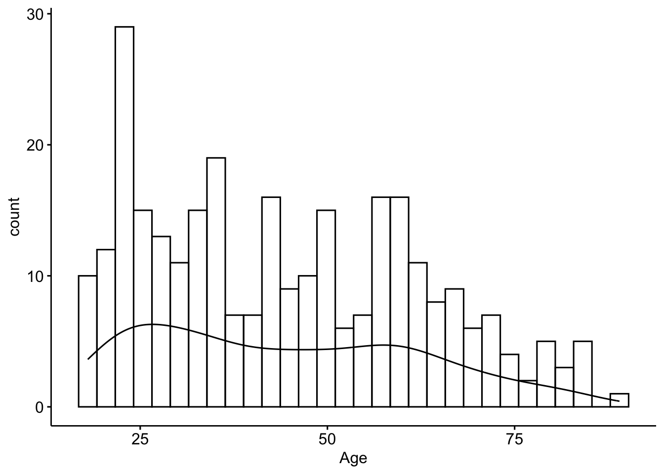
The ages of respondents range from 18 to 89 years old, is bimodal with peaks around 25 and 55ish. The mean age is 44.4 with the median very close at 42.5 - confirming the lack of skew. The standard deviation is 18, and 50% of the reported ages lie between 28 and 59.
Example - Part II
tbl_summary(clean,
            include = c(age, depressed),
            statistic = list(
              all_continuous() ~ "{mean} ({sd})",
              all_categorical() ~ "{n} / {N} ({p}%)"
))| Characteristic | N = 2941 |
|---|---|
| age | 44 (18) |
| depressed | |
| depressed | 45 / 294 (15%) |
| not depressed | 249 / 294 (85%) |
| 1 Mean (SD); n / N (%) | |