library(googlesheets4)
library(ggplot2); library(dplyr)
#url <- "URL TO SHEET HERE" # hiddenSex Discrimination Case Study
Load libraries and specify URL to google sheets (hidden)
Import data and visualize
sim.data <- read_sheet(url) %>%
  select(mfdiff = `(Male - female) difference`)

ggplot(sim.data, aes(x = mfdiff)) +
  geom_dotplot() + theme_bw() +
  geom_vline(xintercept = .292, color = "blue") +
  xlab("point estimate")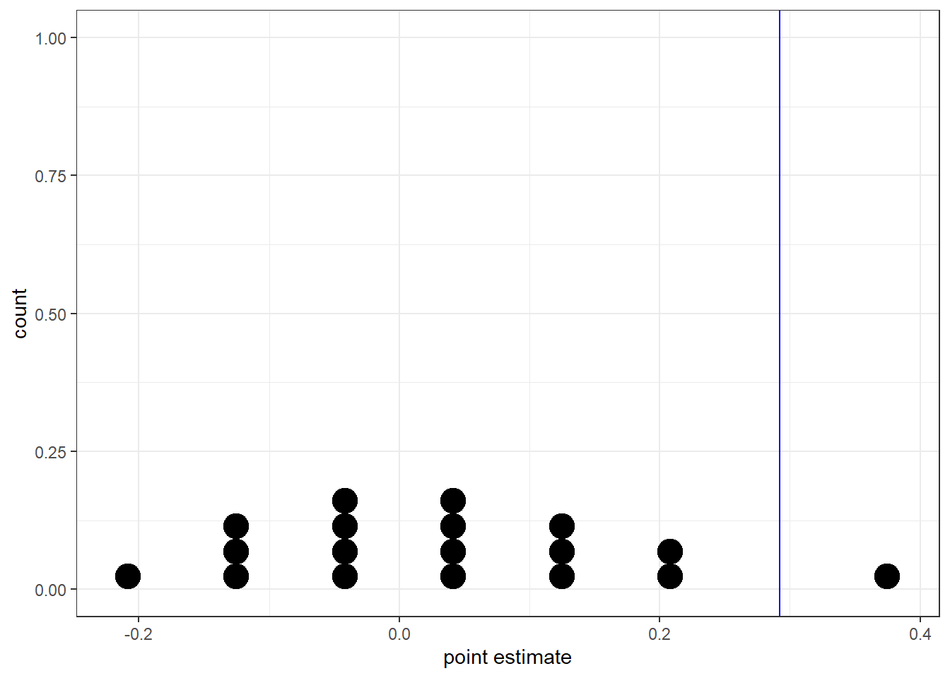
Tip
Describe the distribution of this graph. What does it seem to be centered around?
The distribution of the point estimate (\(p_m-p_f\)) is bell shaped and symmetric around 0, with an outlier up around 0.4. All simulated differences except one are below the 0.292 mark.
Tip
In what percent of simulations did we observe a difference of at least 29.2% (0.292)?
table(sim.data$mfdiff > .292) |> prop.table()
     FALSE       TRUE
0.94444444 0.05555556
In our analysis, we determined that there was only a 5.6% chance of obtaining a sample where \(\geq\) 29.2% more male candidates than female candidates get promoted under the null hypothesis, so we conclude that the data provide evidence of sex discrimination against female candidates by the male supervisors.